Thursday 18 September 2014

Evaluation

During my researched I learned a lot about the representation of different genders in music. For example when we worked on the ITV documentary 'hip hop honeys' we talked about why women were used in music videos and why the were presented how they were.  Women are mainly used in music videos as eye candy and artists believe that no matter how bad the song is, if the video contains a lot of sexually promiscuous women then the song will do well in the charts.  An example of this is Robin Thicke's 'blurred lines'. The song it's self may be catchy but overall it isn't a very good song. However the video contains three sexually promiscuous women walking around barely clothed, following three men. Also in music men are represented as being very dominant. For example in many rap videos it shows men walking around their massive houses full of half naked women. They then proceed to throw around lots of money whilst wearing very expensive clothes and lots of jewellery. They also have lots of fast, sports cars that they drive. In most rap and hip hop videos the male to female ratio is very much on the womens side. An example of this is 50 cents music video of candy shop. In this video there are only two men whilst there appear to be over 50 women. In this video the women all follow the men around. This connotes that the men have controll over the women.

We planned to use adobe photoshop to make an album cover. I intended to include as many gender representations and conventions of an album cover as I could. We also included different types of typography and we used different colours to convey different emotions to the audience. Firstly to help plan we did reviews on two album covers of our choice. We did this to not only help us with the different conventions of an album cover and see what was good and bad about them, but also to help give us an idea for our own personal album covers. We then sketched out ideas for what our album covers could look like. Once we were happy with a design we started to make that on Photoshop. We had to take pictures of ourselves or other classmates to include in our work. We used a green screen to take the photos then we added them to our design.  Once we had made it on photoshop we helped each other improve our designs. 

For my own album cover I planned to have a man in a prison mug shot. I believed that this was a good idea as it incorporates a lot of the things that are included in male music videos. It shows a mischievous man, getting in trouble with the law, and in his mug shot not really caring about it atall. Also using a male in a prison mug shot it conveyed that the audience for my album was mainly males. also on most album covers they include an image of the artist, the name of the artist and the name of the album. i decided to follow these connotation in my own album cover.  For my back album cover i used an image of a prison cell. i used this as i believed it resembled my front cover. i used several tools on photoshop when making my back cover. i again used text boxes to write the name of the different tracks on my album. i also used the burn tool again to make the image of the prison cell darker and more gloomy. this is because i wanted to make it look scarier and more threatening. i also included a bar code in the bottom left of the cover as this is where most album covers place their barcode. i also included a parental advisory logo. this is to how that some of my tracks contain profanity and people should be warned about it.

the main inspiration for my album cover was an album cover from one of my favourite bands 'you me at six'. i decided to try and mimic this idea that they used as i though it looked really good and was very effective.
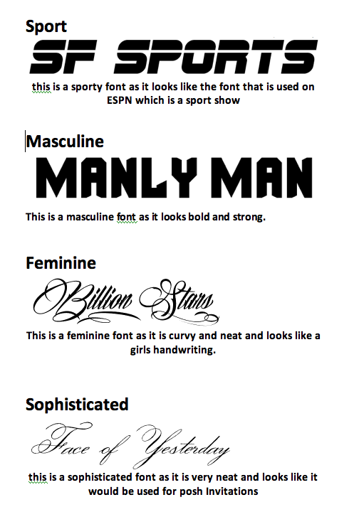
Whilst making my album cover I had to use a wide range of skills on Photoshop. I used the burn tool to make the man on my cover look beaten up and damaged. I also used text boxes to write the name of my album, and the artist.  To get different font styles I had to go onto www.dafont.com and download different fonts to use. I also had to drag my background onto my image and edit it so the image would go behind my photo. I also had to use the eraser tool quite a lot as I had to rub out the background of my photo so you could see the image behind. Finally I used different font colours to help make my text stand out from the background.  


Monday 21 April 2014

Easter Homework.

1. What conventions have I used and why
This magazine cover uses a mix of content. This is shown as one coverline talks about dresses and shopping whilst another coverline talks about speeding points and prison. It uses a mix of content so it attracts a wide range of audience. It also uses a direct mode of address as it says "Your Party" which makes it personal. Also it uses an aspirational tone as they put a well known and aspirational celebrity on the front. 

2. What are the effects of my layout, typography, colour choice and language choice. 
It uses a San serif font which is a informal and chatty font. The colour choice of this magazine is that it has a green background and has red text on top of it so it stands out and it is easy to read. The layout is asymmetrical as there is no set order and there are different amounts of cover lines on each side. 

3. What issues of representation have I presented. An issue of representation in this magazine cover is that little bits of text are unreadable as the background colour matches with the colour of the font. 

Thursday 27 February 2014

Masthead- The masthead is the title. For example in this magazine the title is cosmopolitan

Direct Address- This image uses direct address which means it keeps eye contact with you no matter where you are. Direct address is also used in this as in the text it says 'you' and 'your' to make it personal. For example one coverline says 'already in "your" wardrobe'

Model Credits- The model credit is where they say the models name for example in this the magazine the model credit is jessica alba.

Main Image- The main image is the image of the model. The main image is usually aspirational.

Main Coverline- The main coverline is 'body secrets' you can tell this as it is the largest coverline on the page.

The main colours on cosmopolitan are usually pinks and purples as the magazine is a female magazine and it is trying to attract that sort of audience instead of men.

As this magazine is feminist most of the coverlines are about health, sex and beauty. for example a magazine is "Body secrets"

The text is chatty and informal so it appeals and relates to the audience. 

Thursday 13 February 2014

My Magazine front cover!!


WWW-My magazine cover is good as the title looks like a professional magazine cover and it fits in with the cover.
WWW-Also my magazine cover is good as the main picture and cover-lines contain direct address
WWW-Another reason why my magazine cover is good is because the font style and colours fit in with the image

EBI-To improve my magazine cover i could use different font styles as in most magazine covers they use more than 1 font style.
EBI-Also to improve my magazine cover i could use more colours in the fonts as nearly every magazine will include more than one colour on there cover-lines and only using colour one makes the magazine look plain and boring.
EBI-Another way to make my magazine better is that the background is plain. to make it more colourful and better the background should be a different colour to make it standout and be less plain

Thursday 6 February 2014

colour connotations in magazines


different colours can convey different meanings or connotations to the viewer. 

 for example if you made a sports magazine you would make the main title red as it would convey physical energy, vitality and stamina towards the viewer. I would also make the background yellow as it would make the viewer feel personal power, and it would increase fun. i would also for a coverline involving hiking i would use a green font colour as some sports involve nature and the colour green makes the viewer think about nature.
            
for a gaming magazine i would make the background yellow to make it fun. i would make the title orange to make the viewer feel pleasure and enthusiastic towards the magazine and game. 

For a magazine about ponies i would make the title green as it would make the viewer feel love and nature. i would make the cover lines red to make the viewer to feel passion.

For a magazine about baking i would make the title yellow to make the audience feel fun, creativity and  personal power. I would then make the cover-lines orange as it stimulates productivity, enthusiasm and optimism.

Friday 31 January 2014

Magazine cover design


This is my sketched design of my magazine front cover.  however in the actual design i will make the full title at the at the top of the page instead of the top and bottom. I will also include more cover-lines to make the page fuller and i will include a


Monday 20 January 2014

Ideas for my Magazine title

Teenage Dream
Forever A Teen
Total Teen
Girlfriend
Teenage Weekly
Simply a teenager


cover lines for my magazine

"10 quick fashion tips"
"spice up your summer wardrobe"
"How to got the perfect beach body fast"
"5 secrets about the best boy bands"
"get popular in a week"
"what to wear NOW"
"How to tell him you want to be more than friends"
"10 Top relationship tips"
"back to school shopping list"
"How to throw the worlds best party"
"50 Shades of nail varnish"


Thursday 16 January 2014

Typography


Questions:
  1. How many different font styles do you see on the front cover?
         22
  1. How many different font sizes are used?
         26
  1. How many different font colours are used?
        3
  1. How many coverlines are there?
         8
  1. Describe the font used for the magazine title.
      The font used for the title is bold and it stands out but it is also a modern font.

  1. How does the title communicate who the target audience are?
The title communicates to the age and target audience as it is a womens magazine and the title is in a pink font and the writing is curly and looks quite girly.

  1. What’s the main coverline and how do you know?
The main coverline is “body revolution 12 new body shapes” this is because it is the biggest coverline there and it is the main thing you see except for the main image and title

  1. Explain how and why different colours are used on the cover.
Different colours are used to make it more lively and eye catching.

  1. Explain how and why different fonts are used on the front cover
Different fonts are used on the front cover to show a different perspective of each story and to show that each story is for something else such as they would use girly, curvy fonts for stories for women

  1. If you could change something about the typography on this cover what  would it be and why would change it?
             i would use a wider range of colours as using only 3 colours is quite plain

magazine front covers


 This is Asymmetrical as there is one large main image on the right and it is balanced on the other side by smaller items
This is Asymmetrically balanced by colour as there is a large image on the right however there is alot of colour on the left which draws your eyes towards the colour instead of just the main image


this front cover is symmetrical as everything on both sides are identical and it looks like a mirror reflection of the other side.